
The Power of Colour Decoration in Office Interior Design
In the modern workplace, design is more than visual appeal—it’s a tool that directly influences mood, motivation, and productivity. The best office interior design companies understand that the right colour palette can make the difference between an uninspiring workspace and one that energizes and empowers its people that’s why TossRound is Best Interior Design Company in UAE.
From luxurious office interior companies crafting premium environments to affordable interior design firms helping startups optimize small offices, colour psychology remains one of the most powerful design principles shaping modern workplaces.
🎨 Why Colour Matters in Office Interiors
Colour affects how people feel and behave. Each hue carries emotional and psychological associations that can impact focus, creativity, and communication. In contemporary office spaces, a thoughtful blend of colours can support different work functions—boosting efficiency while fostering well-being.
Professional interior design companies often begin each project with a clear understanding of a client’s brand personality and goals. These insights inform colour choices that align with company culture and the desired atmosphere.
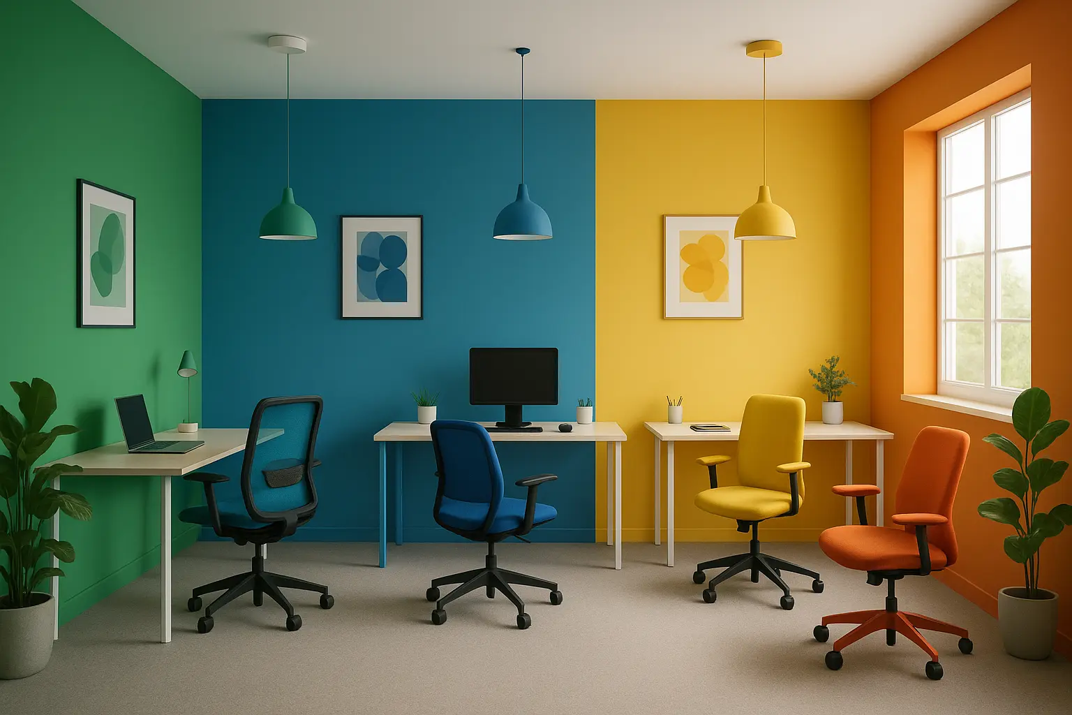
💙 Cool Colours for Focus and Calm
Cool tones such as blue and green are ideal for promoting concentration and relaxation.
- Blue symbolizes trust, peace, and focus. It lowers stress and supports logical thinking—perfect for meeting rooms, executive suites, or any area that requires precision.
- Green evokes balance and harmony. Often associated with nature, it reduces eye strain and encourages steady productivity, making it ideal for open workspaces or long-hour environments.
Leading commercial fit out solutions providers use these tones strategically to encourage calm and clarity across the workplace.
☀️ Warm Colours for Energy and Creativity
Warm hues like yellow and orange create a sense of enthusiasm and optimism.
- Yellow sparks creativity and innovation. It’s perfect for brainstorming areas, collaborative spaces, or design studios. However, moderation is key—too much yellow can become overwhelming.
- Orange promotes excitement and teamwork. Used in lounges or social areas, it encourages communication and a friendly, dynamic culture.
The best interior fit out companies use these colours to enhance collaboration while maintaining visual balance and comfort.
❤️ Other Colours and Their Impact
- Red: A colour of power and passion. Red accents can stimulate energy and confidence when used sparingly in chairs, artwork, or feature walls.
- Purple: Associated with creativity and sophistication. Lighter tones add tranquillity, while deeper shades create an aura of luxury—an approach often used by luxurious office interior companies.
- White & Neutrals: Clean, professional, and timeless. They provide a sense of space and clarity while balancing stronger colours, making them a foundation of successful office interior design.
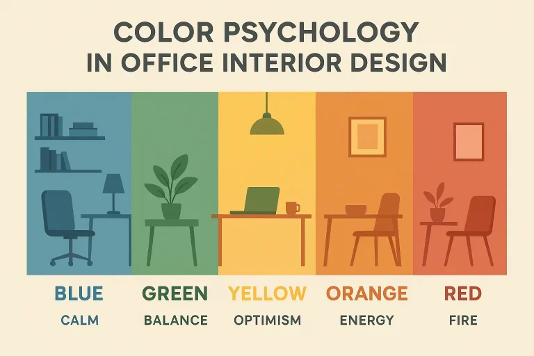
Color Psychology in Office Interior Design
Color psychology in office interior design studies how colors affect mood, focus, and productivity. Using the right colors in workspaces can create a calm, creative, and motivating environment for employees.
| Color | Emotional Effect / Meaning | Best Used In | Design Notes / Tips |
|---|---|---|---|
| Blue | Promotes calm, focus, and trust | Meeting rooms, workstations | Reduces stress; enhances concentration and clear thinking |
| Green | Symbolizes balance, growth, and harmony | Open-plan offices, relaxation zones | Reduces eye strain; great for long work hours |
| Turquoise / Teal | Refreshing, creative, balanced | Creative departments, lounges | Combines calm (blue) with renewal (green) |
| Yellow | Inspires optimism, energy, and creativity | Brainstorming zones, collaboration areas | Use as an accent color; too much can cause fatigue |
| Orange | Encourages enthusiasm and social interaction | Breakout areas, cafeterias | Adds warmth and team energy |
| Red | Increases alertness, excitement, and confidence | Dynamic spaces, reception, artwork | Use sparingly to avoid overstimulation |
| Purple | Represents luxury, ambition, and creativity | Executive offices, design studios | Lighter tones calm; deeper tones feel premium |
| Pink | Creates empathy, comfort, and warmth | Wellness rooms, client lounges | Adds softness and emotional balance |
| White | Symbolizes purity, clarity, and openness | Entire office base, minimalist layouts | Enhances light and space; pairs well with accents |
| Gray | Neutral, balanced, and modern | Backgrounds, corporate settings | Best used as a base for highlighting other colors |
| Black | Powerful, elegant, and sophisticated | Feature walls, executive zones | Adds depth; use sparingly to avoid heaviness |
| Beige / Taupe | Warm, welcoming, and professional | General office areas, waiting rooms | Great for comfort and timeless appeal |
| Brown / Wood Tones | Stable, grounding, and natural | Furniture, flooring, wall panels | Brings organic warmth; pairs well with green and beige |
| Terracotta | Creative, earthy, and authentic | Informal zones, collaborative spaces | Warm yet grounded; great for relaxed environments |
| Gold | Symbol of success, prestige, and luxury | Reception areas, statement pieces | Use for accents to create a premium touch |
| Silver | Modern, sleek, and high-tech | Contemporary office spaces | Works well with white and blue; enhances light |
| Copper / Bronze | Industrial yet warm | Lighting fixtures, detailing | Adds sophistication with subtle warmth |
How to Apply Colour Psychology Effectively
- Match Colour to Function: Choose tones that fit each area’s purpose—cool shades for focus, warm accents for social zones.
- Balance and Contrast: Combine colours carefully to create visual interest without overwhelming the senses.
- Reflect Your Brand: Align the office palette with your brand’s personality to reinforce culture and identity.
- Test Before Committing: Always test paint, lighting, and materials before full implementation.
Transforming Workspaces with Design Insight
Incorporating colour psychology into office interior design is both an art and a science. It’s about understanding how visual cues affect human performance and crafting an environment that nurtures creativity, focus, and well-being.
Whether guided by a luxurious office interior company, a boutique interior design company, or innovative interior decoration companies, the goal is the same creating a workspace that inspires productivity and harmony.
This blog was about Colour Decoration and Color Psychology. Our next blog will be about Color and Astrology/Vastu principles. Stay tuned. Thank you for reading!
Tossround
Interior, Renovation & Fit-Out Specialists
Tossround shares expert tips and insights on interior design, renovations, and Fit-Out. Discover practical advice to transform your spaces with creativity and style.